When talking about photography, I make frequent reference to
"The Picture In My Head," as a way of describing that part of the
photographic process known as "Visualisation". I will return in
another essay to the ways in which visualisation affects practical photography
at the moment of firing the shutter, but for now I want to address matters
concerning the final print (or, indeed, the final screen image if there is no
intention of making a paper print).
In my experience, it is rare for photographers to consciously
think about exactly what they want their photographs to look like. Ansel Adams
is probably the most famous exponent of the idea that the photographer should
consider how the final print is going to look, before the camera is even out of
its case. The best argument in support of this premise is that, if you have no
clear idea of what you want the photograph to look like, how can you begin to
take the necessary steps to realise that objective? The technical mastery that
Adams wielded over the photographic medium meant that he was able to quite
precisely control each step in the process; you can thus be sure that any Adams
print you see appears as he intended you to see it, not as the result of some
lucky accident.
Most users of digital cameras today, in common with most
users of film cameras in the days when I took up photography, are only too
willing to leave the results of all their artistic endeavours in image making
to the fickle finger of fate. Cameras are left in automatic mode, exposures are
determined by some mysterious alchemical process by "the ghost in the
machine", and the prints that emerge from the inkjet printer or from
'Boots the Chemist' are received fatalistically: "There's another cock-up.
I wonder what I've done wrong this time." In the days of film, of course,
unless you had the enthusiasm, the money and the space to set up a darkroom,
then the quality of your prints was in the hands of an anonymous photo-lab
technician. Nowadays, with computers and digital imaging software such as
Photoshop, there is little excuse for not ending up with an image that at least
approximates to the picture that you want the outside world to see.
Photographers should no longer be content to say "Well, it's not quite
what I had in mind, but it's not bad". With only a little basic skill, a
few of the simple tools available in Photoshop, and the expenditure of some
time, it is a straightforward task to take a photograph that is "almost
there", and turn it into a photograph that looks the way you want it to.
Not by accident, but by design.

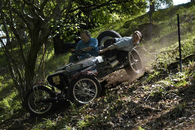
In the first picture (the unmodified image as exposed in the camera, above), the light in the top right quadrant is picking out the dust being kicked up by the wheels, but in holding the highlight detail, the exposure has led to the car, and particularly the driver, being lost in deep shadow. To make the image that I wish to show to people, I want to retain the quality of the light in the upper right, but increase the brightness in the shadow area to reveal the car and its occupants. To do this, because I am not well versed in the use of Photoshop (and for many years used Photoshop versions 6 and 7), I make use of the following very basic Photoshop tools and techniques (there are other, more sophisticated, techniques, utilising layers and masks, but I have not yet learned to use these): the lasso, the polygonal lasso, and very occasionally, the magnetic lasso. Depending on the object(s) that I am selecting, I may use the tools unfeathered (this produces a very hard-edged selection, and can produce very strange effects at the boundary of the selection), or more usually, feathered by between 10 and 20 pixels (which produces a softer edge to the selection, and blurs the boundary, so making the transition edge neater and harder to see). To feather the selection, click in the box in the tool properties bar at the top (below the menu bar). Tick in 'anti-aliased' to smooth transitions across the selection boundary.

So my first action is to make a selection roughly as shown above, using the lasso. I then select 'inverse' from the Select menu, then choose Image/Adjustments/Levels and, using the centre slider, adjust the gamma of the image to raise the brightness in the shadow area. This is done on a "what feels right" basis - if at first you don't achieve exactly the result you want, just click in one of the previous stages in the history palette and start again.

This leaves us with the situation above. I now select 'inverse' again, and using Levels again, adjust the gamma in the highlight area to darken it down.

This gives us the image above, which now requires an overall brightening. This is done by first deselecting the selection, and then using Levels again to adjust the gamma of the whole image to brighten it.

Once more this is on a "what feels right" basis - we don't want to burn out the highlights after we have gone to all the trouble of preserving them - and leads us to the image as seen above.

We are almost there now,
but the area just around the driver is still too dark, so I make a selection
with the lasso as shown above, adjust the gamma to taste, apply sharpening
(Filter/Sharpen/Unsharp mask - around 200%), and this leaves us with the final
image below. We still have the highlights, we still have the backlit dust being
kicked up by the wheels, but we have found the driver and the passenger and
raised them from their gloomy obscurity. Proof, I hope, that it is worth
spending some time, and making some effort, to produce the visible image that
you want to show the world, and not being satisfied with what the camera
manufacturer's software gives you.
 |
| The resultant image after the selection and adjustment procedure detailed above |
In a recent, unexpected move towards modernisation, I came into possession of Photoshop CS2, version 9. This version contains a new adjustment control, 'Shadow/Highlight' (Image/Adjustments/Shadow/Highlight) which allows a similar result to be achieved without the necessity of going through all the selection procedures detailed above. This could be the subject of a future essay, but for the time being, the picture shown below is the result of adjusting the same picture using Shadow/Highlight - a quite similar result, if anything with somewhat more in the way of shadow detail, but much easier to achieve. For those still using versions of Photoshop earlier than 8, the selection procedure is still the one to adopt. But for those able to upgrade to version 9 (or presumably all of the more recent versions) the the use of the Shadow/Highlight control significantly simplifies dealing with such high contrast situations.
 |
| The same image, arrived at using the Shadow/Highlight tool |
No comments:
Post a Comment